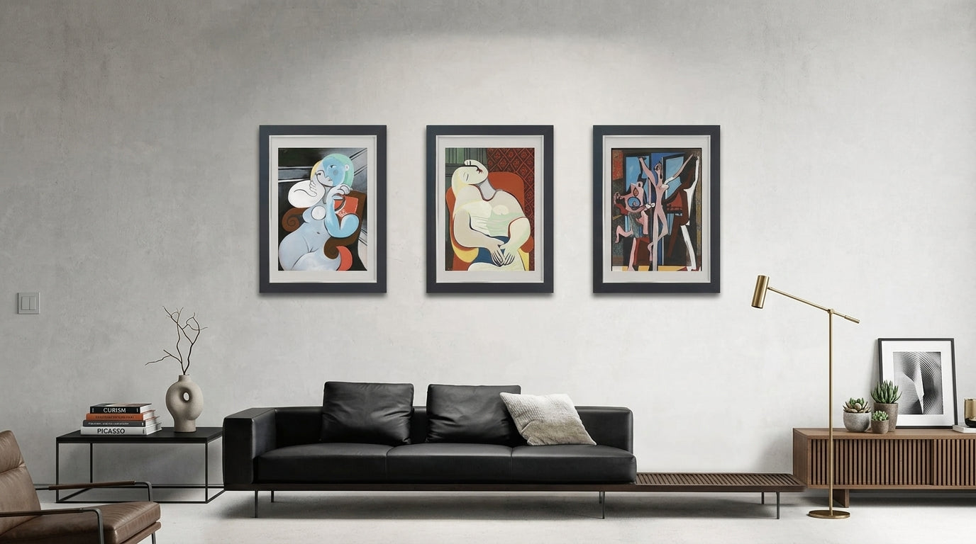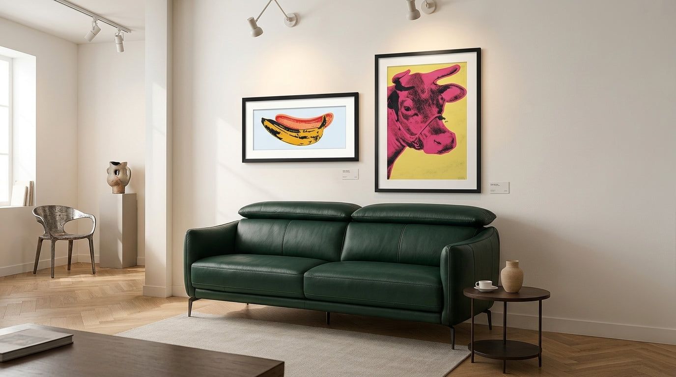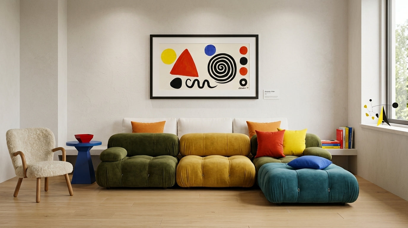

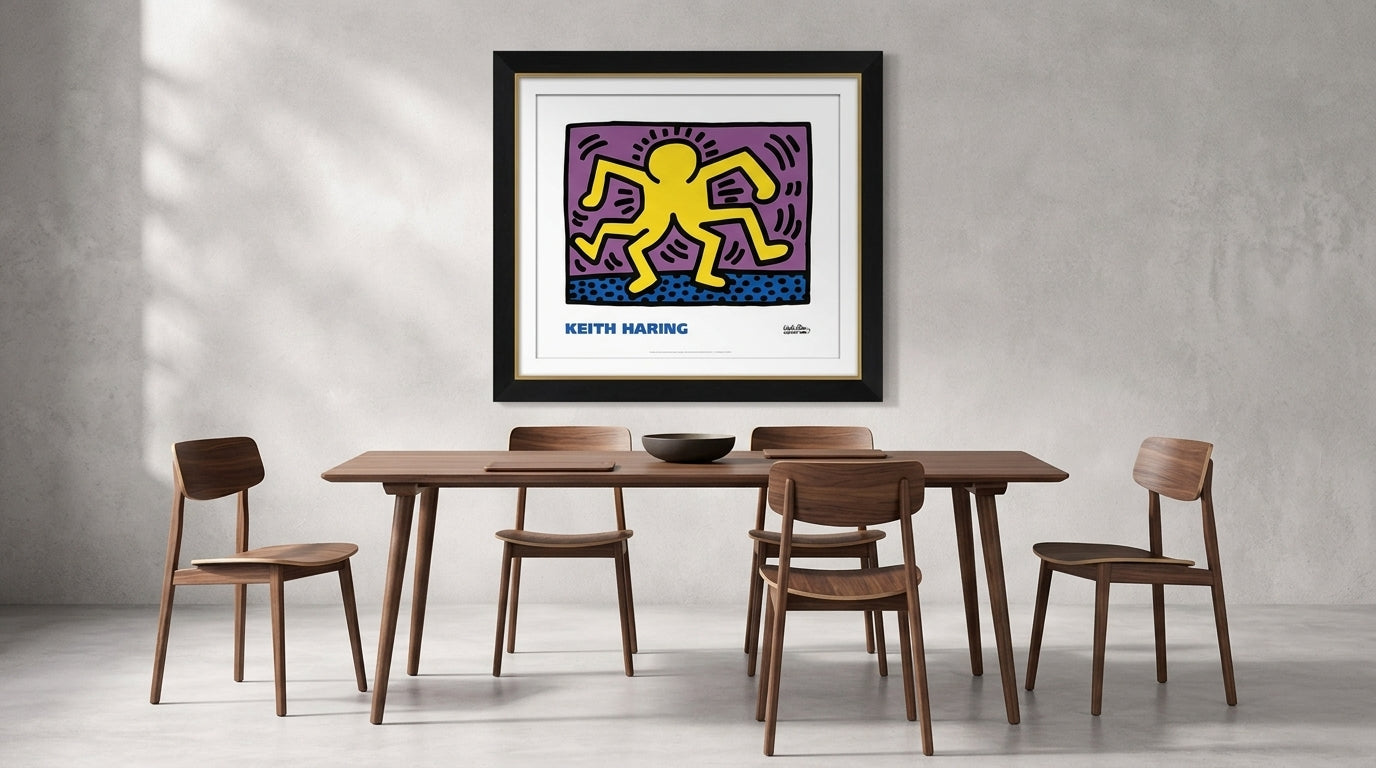

Wood furniture brings natural warmth, texture and visual permanence to an interior. The right artwork can strengthen those qualities without making the room feel overly traditional or heavily coordinated.
The key is not to find art that matches the wood exactly. It is to create a relationship through colour temperature, contrast and proportion.

Identify the Undertone of the Wood
Wood finishes may appear neutral at first, but they often contain noticeable undertones.
Walnut commonly carries warm brown, chocolate, reddish or slightly purple notes. Lighter oak and beech finishes may have beige, honey or yellow undertones. Dark-stained wood may appear almost black and create a stronger graphic presence.
Look for artwork containing colours that either relate to or contrast with these undertones.
Pairing Art with Walnut Furniture
Walnut works particularly well with:
- deep green;
- navy and muted blue;
- ochre and rust;
- cream and warm white;
- burgundy;
- dusty pink; and
- controlled black accents.
Botanical art, atmospheric landscapes and colour-field abstractions can all work beautifully with walnut.
For a quieter interior, choose artwork with soft natural colours. For stronger contrast, introduce bright red, cobalt blue or yellow through a modern abstract or Pop Art piece.
Pairing Art with Light Wood
Light wood furniture creates an airy, relaxed atmosphere. It works well with:
- soft blue and green;
- warm grey;
- terracotta;
- black linework;
- pale botanical colours; and
- gentle neutral compositions.
A black-framed artwork can provide useful definition against light walls and pale furniture. Alternatively, a natural timber frame can maintain a softer Scandinavian or Japandi direction.
Dark Wood and High-Contrast Art
Dark wood furniture can support visually powerful artwork.
Consider:
- bright graphic prints;
- artwork with generous white space;
- strong geometric abstraction;
- vivid Pop Art;
- pale landscapes; or
- compositions with clear blocks of colour.
Avoid filling the entire room with dark colours. If the furniture, flooring and artwork are all visually heavy, introduce lighter walls, upholstery or framing to restore balance.
Should the Artwork Frame Match the Furniture?
The frame does not need to match the furniture finish exactly.
Trying to match two timber finishes closely can sometimes highlight their differences rather than create harmony.
Instead, consider:
- black frames for architectural definition;
- white frames for a lighter presentation;
- natural wood frames for warmth;
- metallic frames for a more polished setting; or
- frameless presentations for contemporary abstraction.
The frame should first suit the artwork, then relate to the wider room.
Use Contrast Intentionally
Warm wood paired with equally warm art creates a calm and cohesive interior.
Warm wood paired with cool blue or green artwork creates contrast while preserving balance.
Neither approach is automatically better. The correct choice depends on whether you want the room to feel restful, expressive or dramatic.
Create an Art-Led Dining or Living Space
Explore licensed artwork with Picket&Rail’s American hardwood tables, chairs, beds and living-room furniture.